- A colour palette
- A sound palette
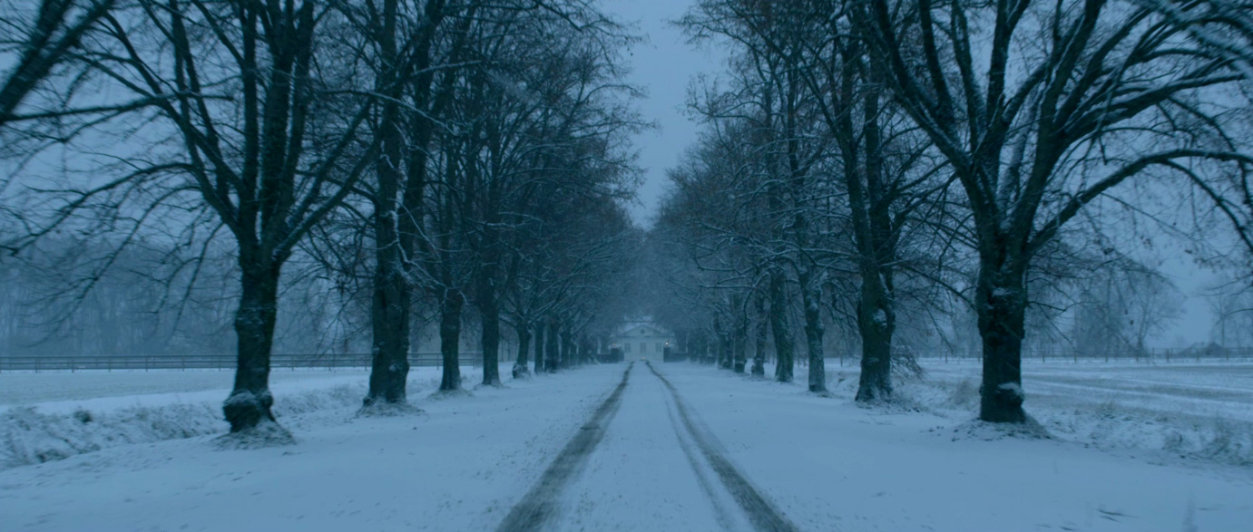
- 9 key shots frame
Our colour palette that we created:
Our chosen colour palette creates a vision that allows us to stick with the look and feel of our opening title sequence. These colours suggest a dark and mysterious theme, as that is what we want our viewers to experience when watching. Our genre is a psychological thriller and we felt that these colours best fit this genre.


The two shades of brown shows the wood in the barn. The next colour shows the dirt and marks that will be on the girl, and also the colour of the bucket that we will use to show credits on. The green colour illustrates the trees in the forest that will be outside when the girl escapes from the barn. The dark grey shows more darkness that will occur throughout in the barn and outside.

Our sound palette that we created:
Our sound palette shows examples of a woman heavily breathing, helicopter sounds for our drone shot, police sirens and water dripping. These are the type of sounds that you will hear in our opening title sequence as they all create suspense and may make the audience feel uneasy.
Our sound palette shows examples of a woman heavily breathing, helicopter sounds for our drone shot, police sirens and water dripping. These are the type of sounds that you will hear in our opening title sequence as they all create suspense and may make the audience feel uneasy.
Our frame of 9 key shots:
Our 9 key shots are the shots that we thought were most memorable and gave the best impression of the storyline to our opening title sequence.
Our 9 key shots are the shots that we thought were most memorable and gave the best impression of the storyline to our opening title sequence.